Why do funnels matter?
For every flow throughout your product, more people will start it than complete it successfully. The primary value of funnels comes from the ability to inspect the journey of everyone going through that flow and understanding where the bottlenecks and friction points are in it. Once you can isolate these bottlenecks and understand what's causing them, you'll be able to significantly improve the success of your users.
What can you learn from funnels?
- Understand where people are getting stuck during your flow
- Find out who is successful and who is not
- Identify the steps which have the highest friction and time to convert
- Identify possible causes of failure or success
- Understand how your changes are improving your activation flow
- Understand seasonality in your conversion rates
- Refining your funnel to filter out noise
Getting started
Creating a funnels insight
- Click Product Analytics on the left sidebar
- Click the + New Insights tab
- Select the Funnel option in the dropdown
Adding and refining steps in your funnel
Select the steps you wish to include in your funnel, ideally starting with the first event/action a user will trigger in the flow you wish to measure. Next, add intermediate events you believe users need to go through to be successful and finish with the event you consider to be the success for this flow. It's best to start with the simplest flow and avoid using optional steps to ensure you don't filter out or skew valuable results.
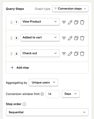
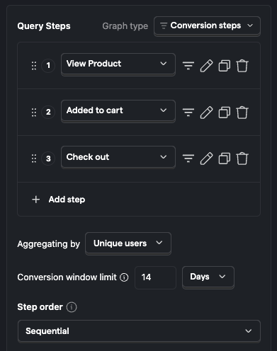
You may wish to refine your steps further, filtering out certain types of users or event properties (e.g. country of a user). Click the "Show filter" icon next to the step you wish to refine further and select the filter you would like to add, or set a global filter in the filters section in the bottom.
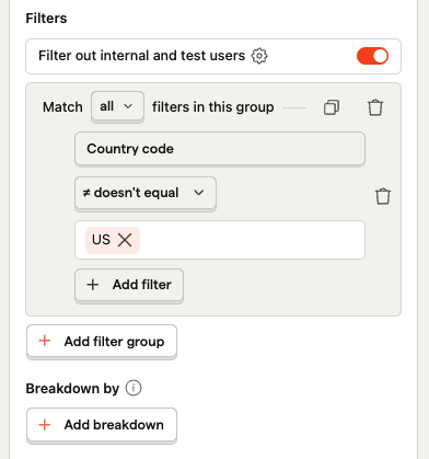
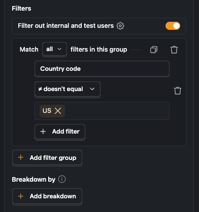
Note: Using user properties in funnels requires capturing person profiles.
Setting a time range
You now have a basic funnel showing in the main analysis pane and can modify the time range you would like to look at. A good place to start is to look at a time range of 30 days to ensure the effects of any day to day variations will be reduced.
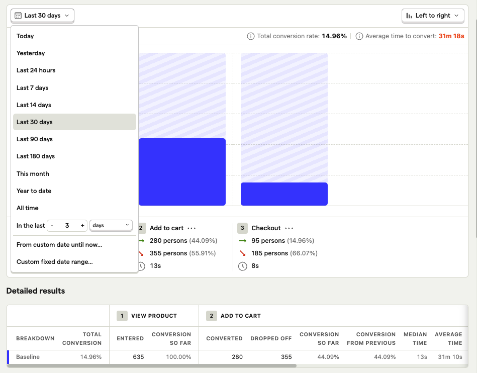
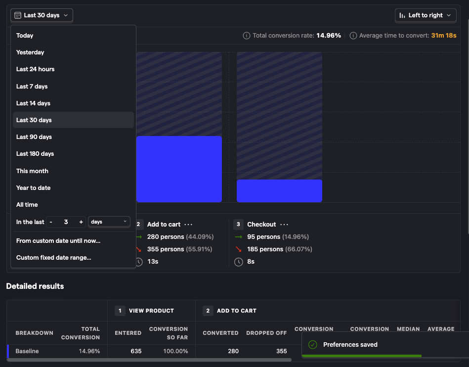
You should now see where people are struggling in your flow by seeing where the drop-offs are. In the example above, we can see that the biggest drop-off is between the 'Add to cart' and 'Checkout' stages of the funnel.
Saving a funnel
Step 1: Click save
If you're measuring something recurrently, you'd like to share it with others, or easily return to it again in the future, hit the "Save" button located at the top right corner.
You can rename the automatically generated insight name by clicking on the pencil icon beside the name.
Step 2: Add a saved funnel to a dashboard or a notebook
You can add a saved funnel to a dashboard or a notebook by clicking on the "Add to dashboard" or the "Add to notebook" button beside the "Edit" button located at the top right corner of the page.
Step 3: Find a saved funnel
You can find your funnel any time by navigating to the dashboard or notebook you've saved it in. You can also find it by visiting Product Analytics tab and filtering the insights by type "Funnel".
Modifying a funnel
Once you have your funnel setup, you may like to tweak the step ordering or filters; this is easy. Steps can be dragged around by clicking and holding down the icon to the left of the step number in the configuration area of the screen.
Analyzing Funnels
Understand where people are getting stuck during your flow
The most common use case for funnels is understanding where people are getting stuck or dropping off in your flow.
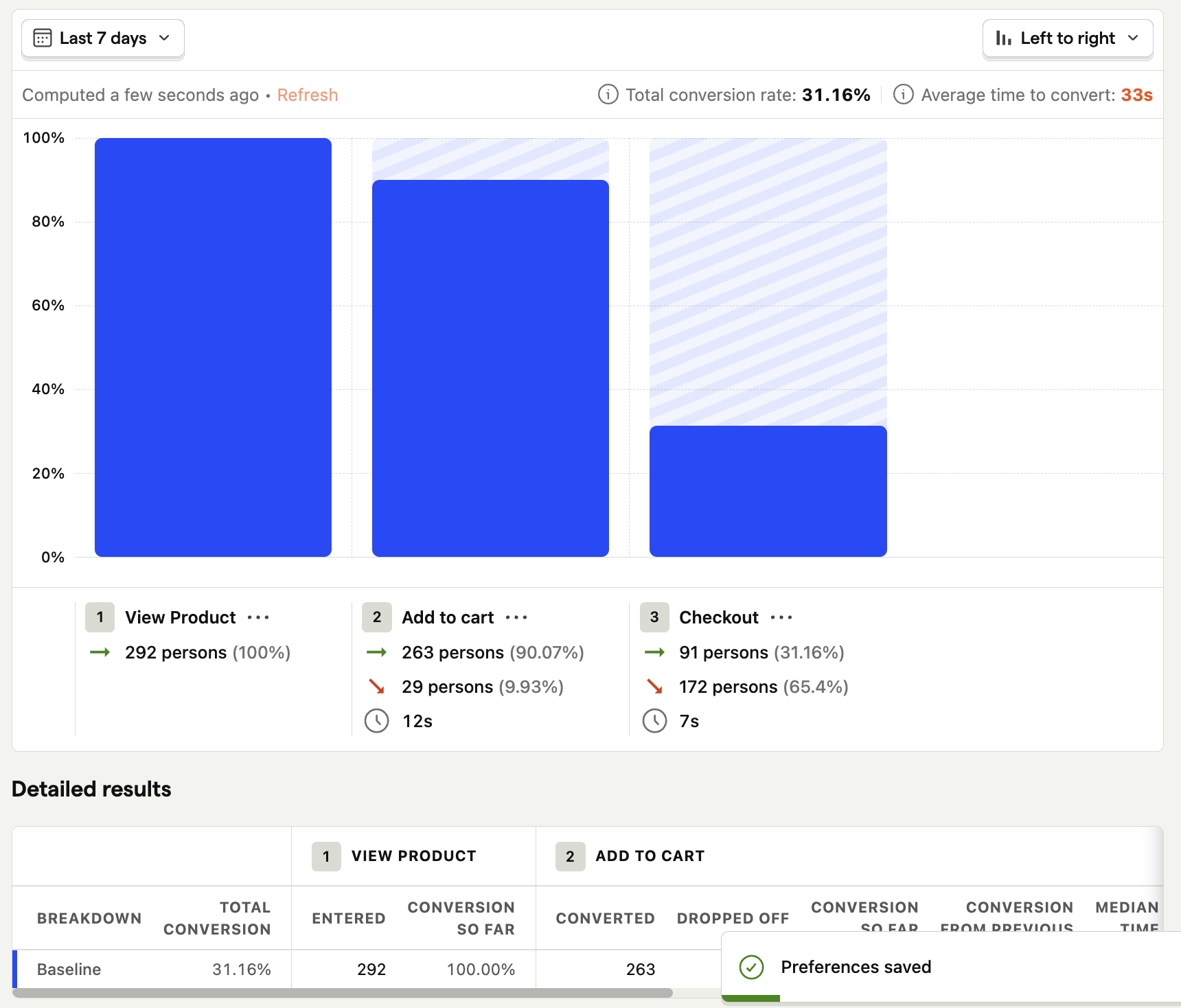
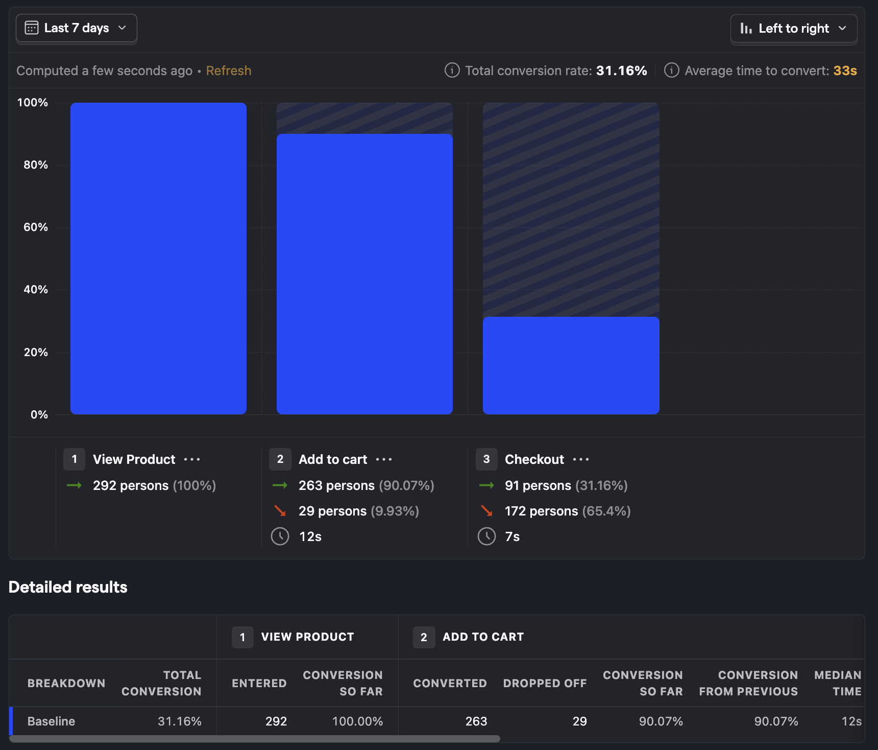
Quickly looking at this funnel, we can see there are several drop-offs between steps. Absolute drop-off is a great way to understand where you're losing the most people. If you want to identify the areas that have the greatest negative impact on your overall conversion rate, you'll want to understand the relative drop-off. Switch to relative drop-off by clicking "Overall conversion" and switching to "Relative to previous step" under the Conversion Rate Calculation field on the left funnel configuration pane.
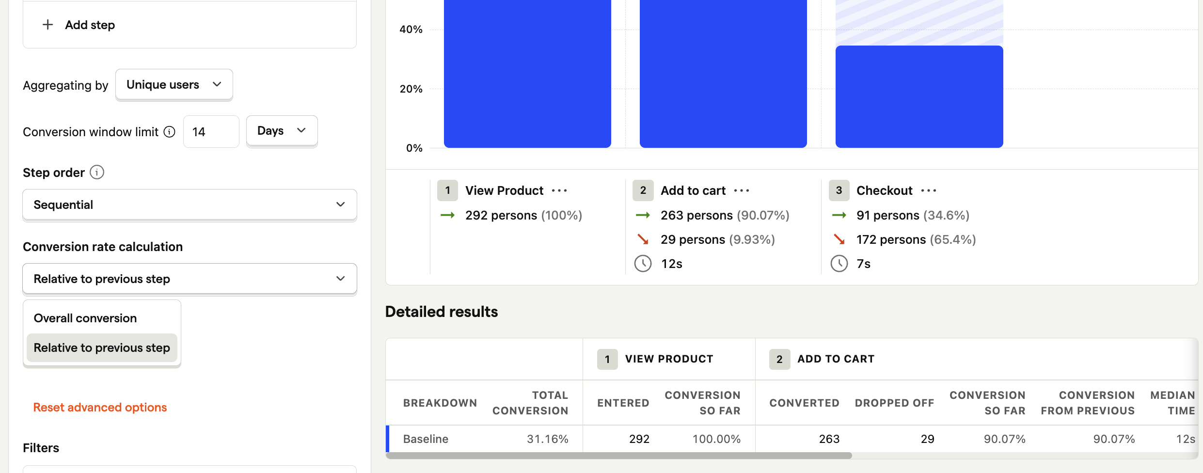
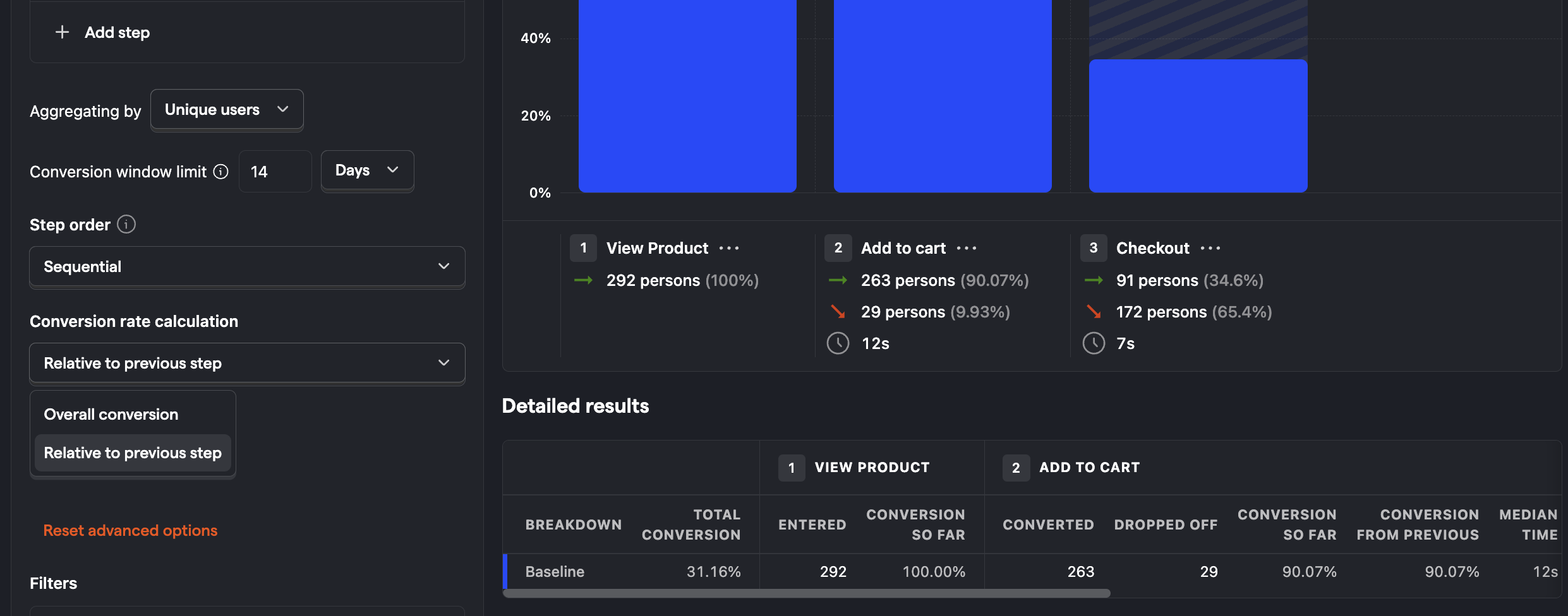
You can use this to see where the biggest opportunity for improvement is, usually on the step with the lowest relative conversion rate.
Find out who is successful and who is not
Once you have a funnel drop-off you'd like to explore further, the first step is to identify whether it's a specific client or users that are having the problem and find out why they were struggling. There are many ways to get this information, from reaching out to them directly to replaying their session.
Click on the bars in the chart or the linked numbers in the column values of table below the funnel to see the people who COMPLETED or DROPPED this step of your funnel.
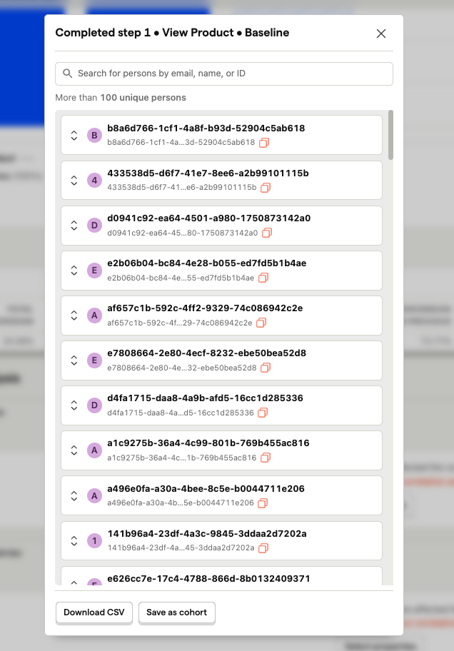
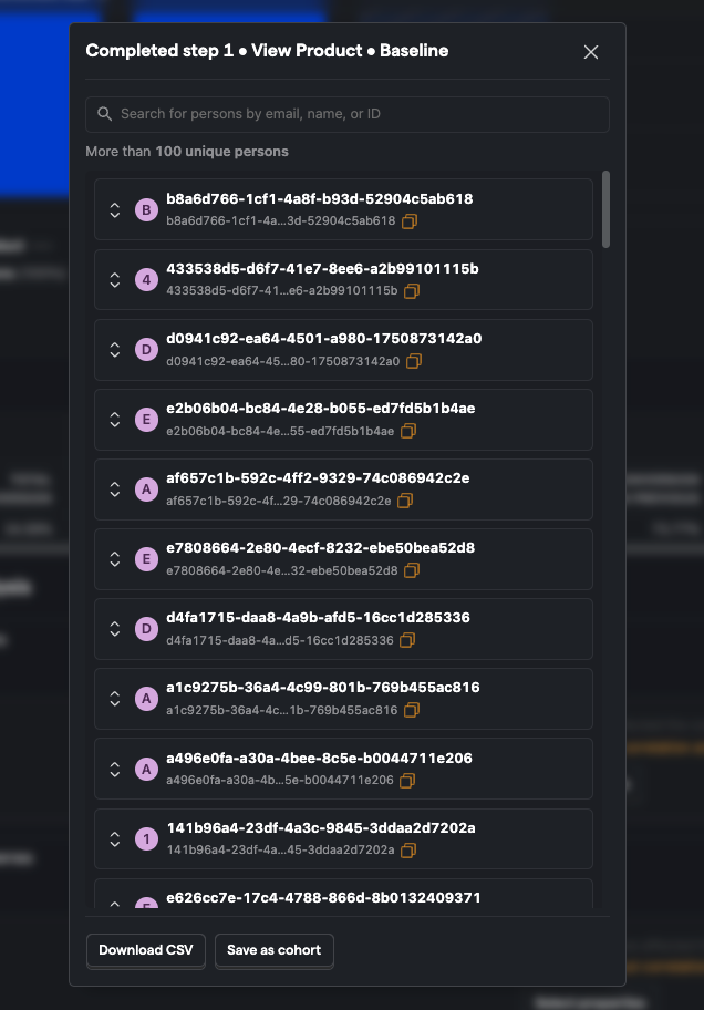
From here, you can explore the individual people further by viewing session recordings to see exactly what they were doing when they dropped off. You can also use this feature to watch a successful user go through your funnel. Understanding what successful users do can also help you identify improvement points for those who aren't successful.
Identify the steps which have the highest friction and time to convert
One reason users may drop-off can be the raw effort required to complete the step. Perhaps it includes a complex form or requires them to go to their emails or another tool to get the information required to complete the step.
A fast way to get a feel for whether or not a step has high friction is to look at the average time to convert. Steps with a long time to convert are likely much harder than steps with a short time to convert.


However, it might not be so simple as just looking at the average conversion time between steps. To dig deeper, click on the conversion time, and you will be presented with a distribution histogram of time to convert.
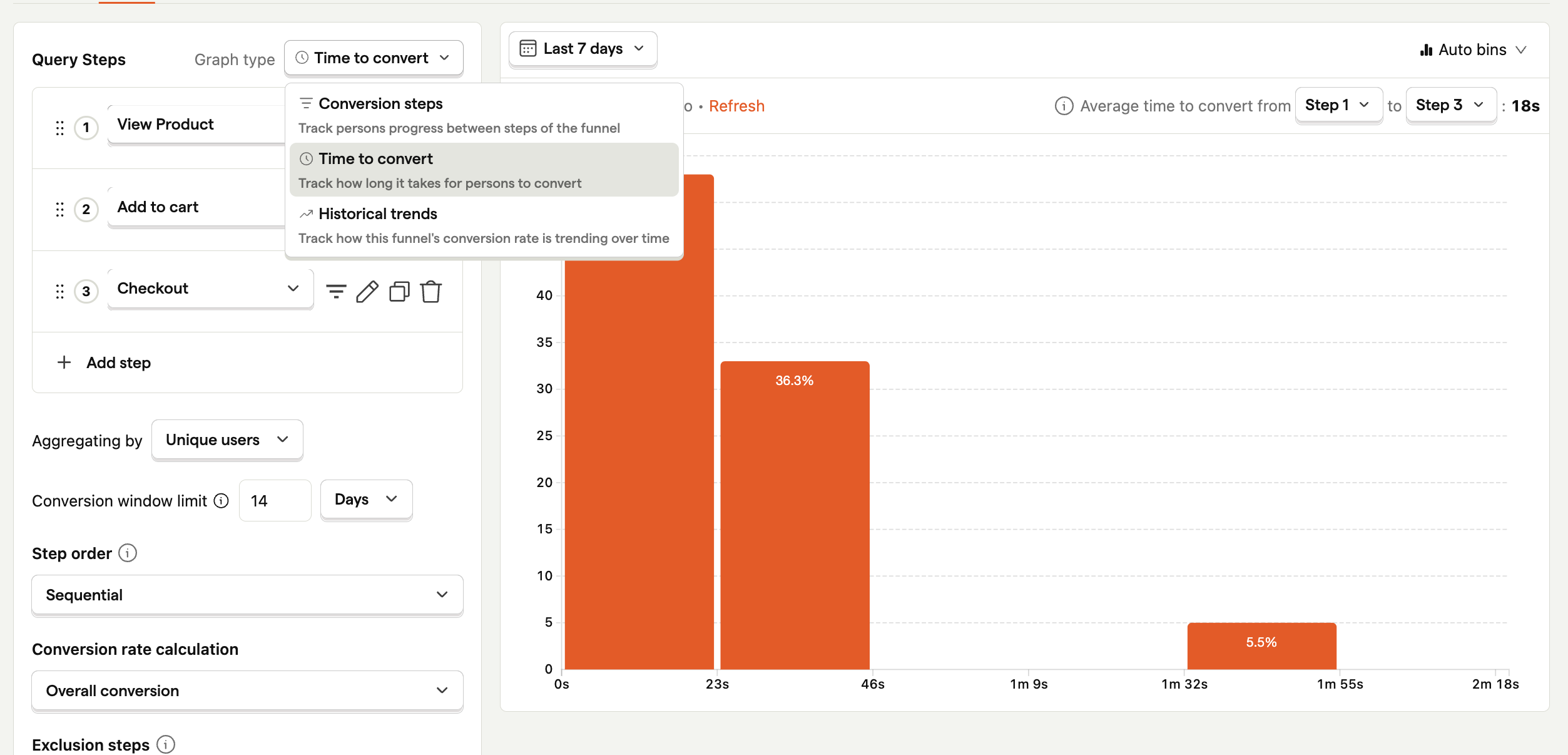
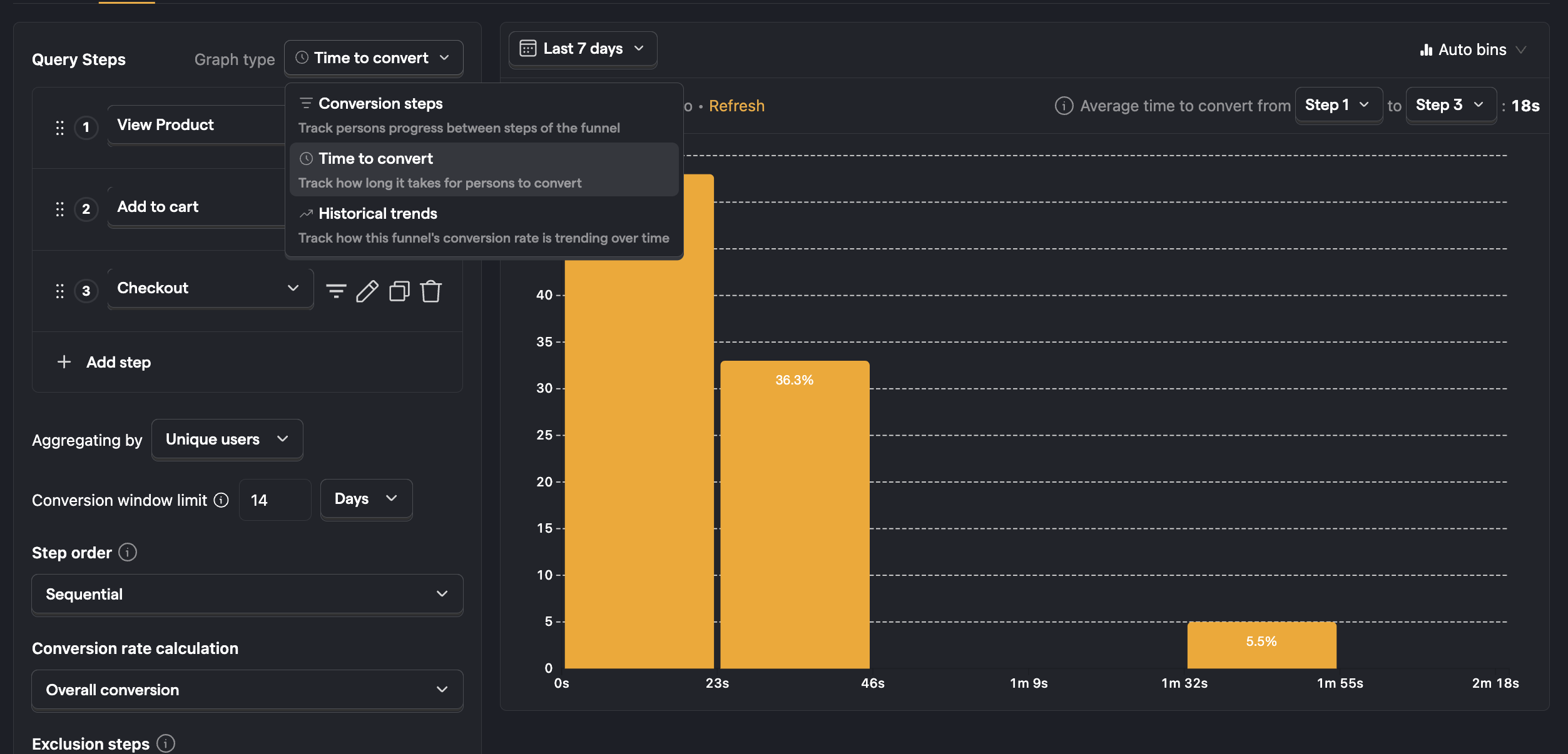
If all the data is grouped in one bar (known as a bin - in histogram speak), you can increase the number of bins to get a more granular view of the conversion time distribution.
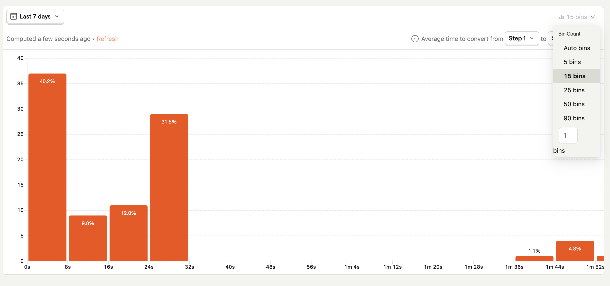
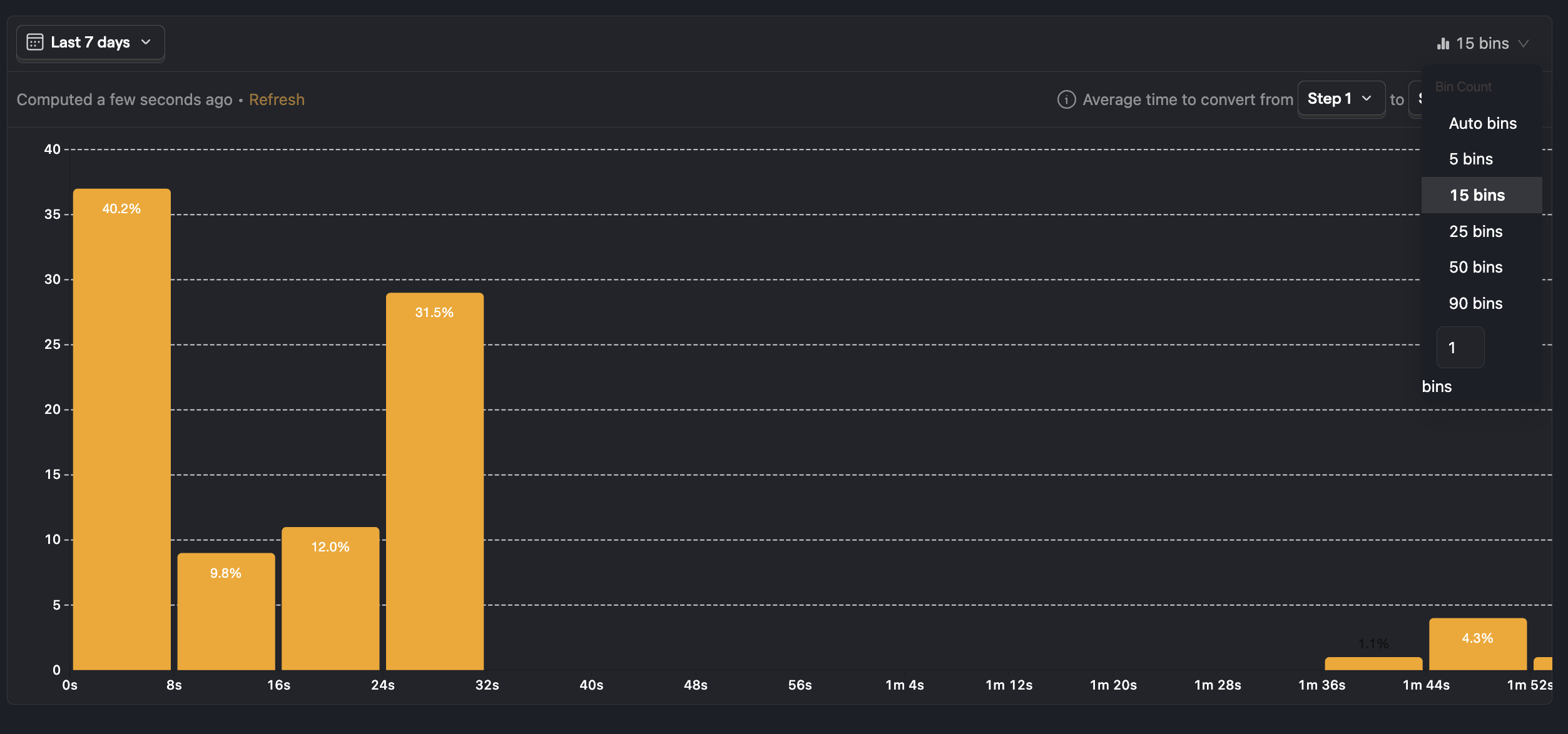
This graph illustrates how common it is to go through these steps at different paces. If your graph is skewed towards the left, this means most people are going through this step very fast. If the graph is skewed towards the right, people are going through this step slowly.
You may see other patterns in the graph, including a double hump where you have two peaks; this indicates that there are two distinct types of experience or user, where some are going through fast and others slower. The group that is taking more time is likely experiencing significantly more friction than the group that is going through fast.
Identify possible causes of failure and success
Now you have a funnel and can see people are struggling on certain steps, you should work out why. We have a tool designed specifically for this use case - to start, you'll want to think of a hypothesis of what might be causing the issue. A common one is people often struggle to use a web-based product on a mobile device since it's not optimized fully.
Click on "Show advanced options" link on the funnel configuration pane. Then click on the "+ Add breakdown" button and select OS (Operating System) from person properties.
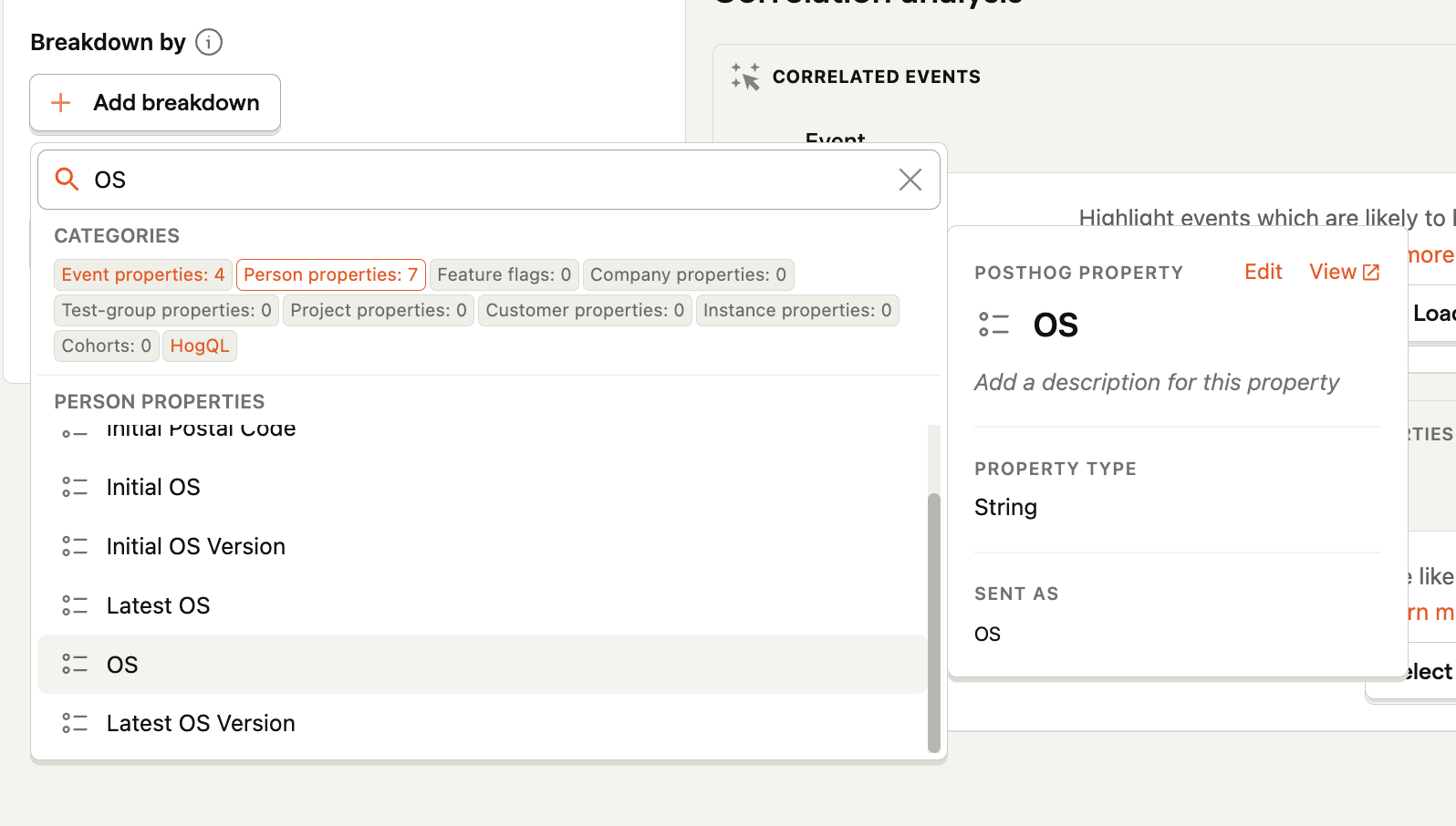
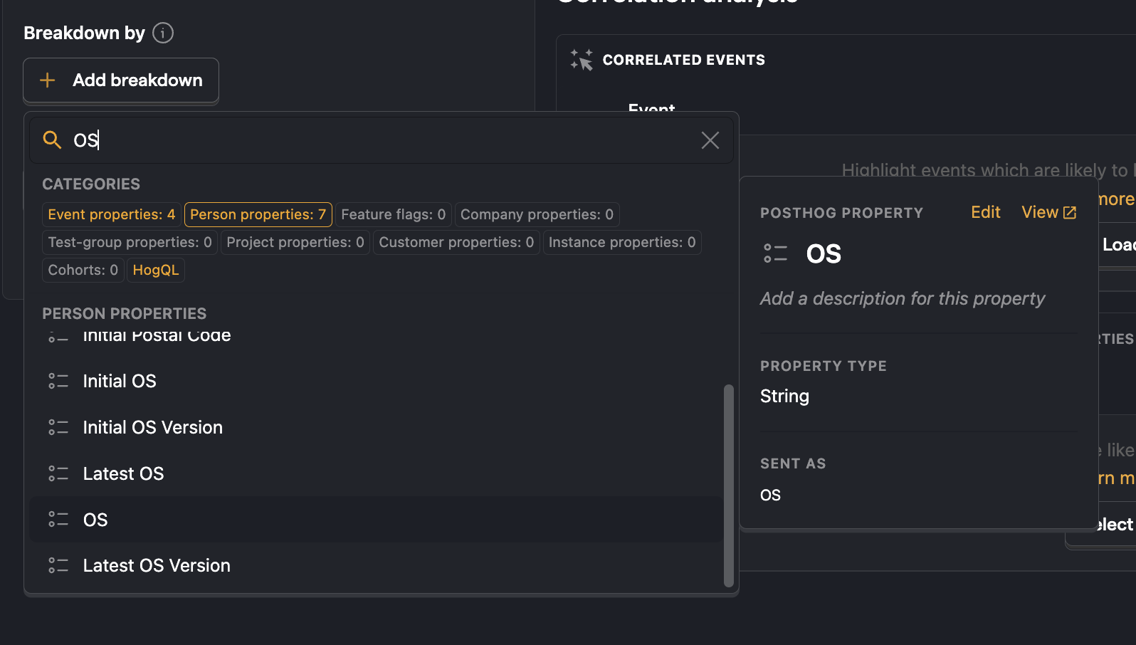
This will break down the funnel by OS.
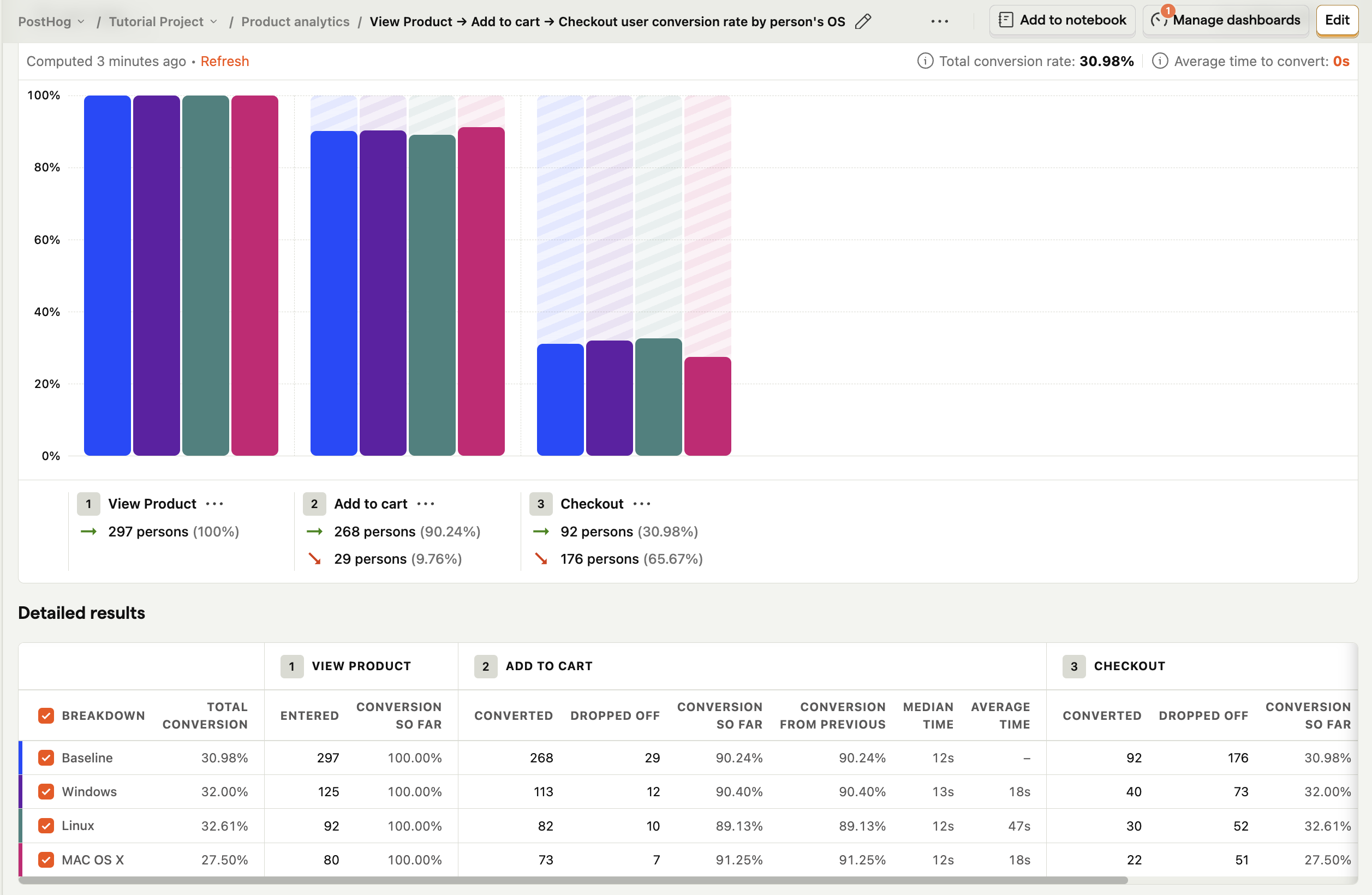
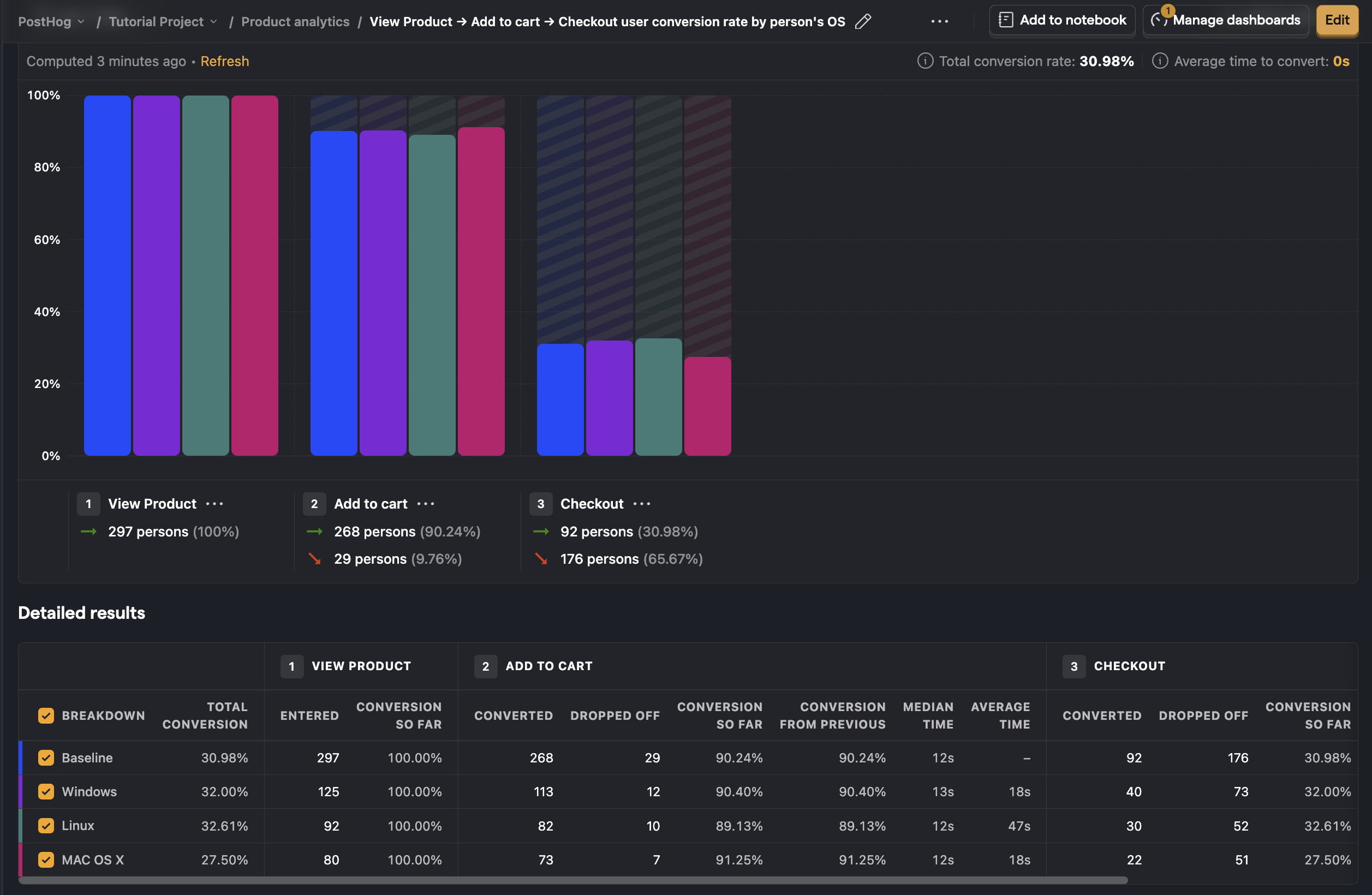
You can instantly see that the conversion rate is lower on Mac OS X; this indicates that it could be a cause of drop-off in this funnel. To validate it, click through to the persons modal to watch a session recording (if enabled on your instance) or try the flow yourself on the mobile device.
You can break down by a number of user and event properties (e.g. browser, country, etc.) to help quickly validate the initial hypothesis you may have.
The above process depends on thinking up a hypothesis to test. PostHog can also do this thinking for you, by automatically showing you which events and properties most significantly affect the conversion rate of users. To find out how to use this feature, check out Correlation Analysis.
Understand how your changes are improving your flow
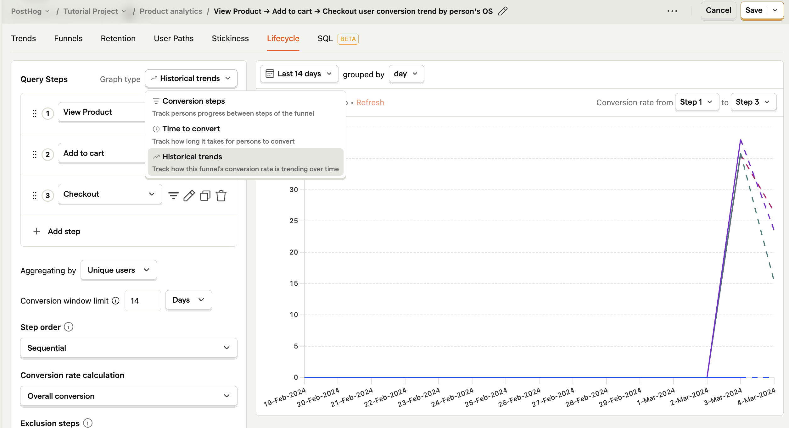
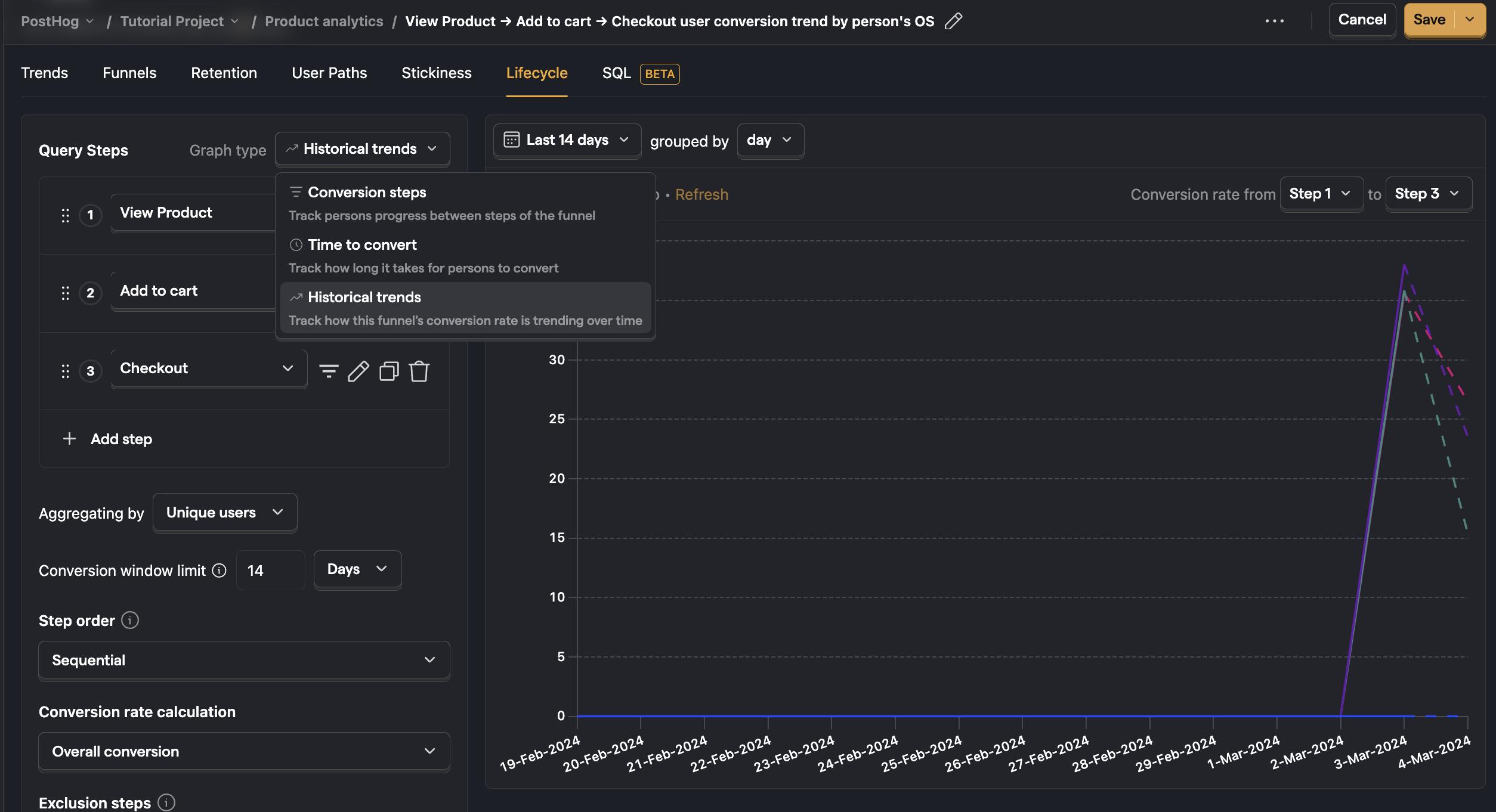
There are multiple ways to understand how your changes, fixes, and new features affect your funnel success rate - the simplest and most common is to look at how the conversion rate changes over time.
In the configuration pane, switch graph type to the Historical trends to show you how your conversion rate has changed over time. For example, if you launched a new feature a few weeks ago and expect it to have improved your conversion rate, you should see this through a change in the trend on the graph. You may wish to change the granularity and time range to focus on what happened after specific changes.
A more advanced approach is to use experimentation to run a simple A/B test. You can create an experiment and assign 50% of people to the test group and 50% to the control group.
You can then break down your funnel by this feature flag and compare the conversion rate for the people in the test (feature flag on) and control (feature flag off) to see if there is a significant difference.
N.B. When it comes to A/B testing - it's important to recognize that there can be a lot of noise in experiments and if you have a minimal improvement in your conversion rate is more likely to be due to some bias or noise than your feature being worse or better. Over time, we will build out more advanced A/B testing capabilities with built-in statistical analysis to help you understand the confidence level in the results. Check out our roadmap to learn more.
Choosing breakdown property behaviour
When creating a funnel with a mix of frontend and backend events, such as $pageview and user sign up, it's very much possible that the same properties don't exist on every event. In such a case, when you want to breakdown by browser, you can choose from which step the properties should be selected, by modifying the attribution type right below the breakdown.
There are four modes to choose from.
First touchpoint
In this case, the first property value seen from all steps is chosen.
Consider this example sequence of events:
$pageviewwithbrowser = Chromeuser signed upwithbrowser = Firefox
The first touchpoint means that Chrome will be the breakdown value.
With the first touchpoint mode, one person will always only have one value.
Last touchpoint
In this case, the last property value seen from all steps is chosen.
Consider the same example as above:
$pageviewwithbrowser = Chromeuser signed upwithbrowser = Firefox
The last touchpoint means that Firefox will be the breakdown value.
With the last touchpoint mode, one person will always only have one value.
Specific step
In this case, only the property value seen at that specific step is chosen.
For the example above, when step one is chosen the value will be either Chrome or Firefox.
However, with the specific step mode, one person can have more than one property value.
For example, if the events were:
$pageviewwithbrowser = Chromeuser signed upwithbrowser = Chrome$pageviewwithbrowser = Firefoxuser signed upwithbrowser = Firefox
Then for both step 1 and 2 attribution, the person would have both Chrome and Firefox as their breakdown values.
For an unordered funnel, the specific step is meaningless, as the first step can be the last step, and vice versa. So, it's referred to as "any step" in the UI. It has the same semantics as a specific step in an ordered funnel, but it looks at property values from all steps.
All steps
In this case, the property value must be seen in all steps to be considered in the funnel.
Understand seasonality in your conversion rates
It's unlikely that your conversion rate will remain stable every day or every week. This is normal, but it's important to understand the external factors that can cause these fluctuations so you don't jump to conclusions too quickly when analyzing a big change or drop-off.
To look at the seasonality of your conversion rates, click through to the historical trends view over the time period you might expect seasonal variations.
A common seasonality to watch out for is weekends, particularly if your product is aimed at businesses. Perhaps you have a yearly sale such as "Black Friday", which increases the number of people coming to your site and increases the expectation of discounts.
In this view, you can adjust the date ranges to observe key seasonal trends. You can then look at your funnel to determine if it's just a seasonal trend affecting it or whether something has materially changed in your product, making the experience better or worse.
Refining your funnel to filter out noise
When you've dialled in your funnel, and you're comfortable getting results and identifying the biggest drop-offs, you can take further steps to improve the signal to noise ratio.
The most common configurations you might consider tweaking are:
- Conversion window limit: This sets how long to wait before you consider someone a failure if they don't achieve the success event. Reducing the conversion window will ensure you see who went through the funnel in a short space of time; increasing it will capture people who went partway through the funnel, went away and came back later to complete it. Setting up an appropriate conversion window limit will also ensure your conversion rate is not changing over time as you measure it.
- Step order:
- Sequential: When measuring people who've gone through the steps in your funnel in the order set, and they have triggered several other events in between. For example, when measuring an advert's effect on conversion, whether someone has seen the ad before or after coming to your product would likely result in a different conversion rate. The first occurrences of events specified in steps are taken into account (within the conversion window).
- Strict Order: When you only want to measure people who've gone through the steps in your funnel in order and not triggered any other events in between. For example, if you want to exclude users who have searched for another product after initially finding a product in a checkout funnel)
- Any Order: When measuring people who've gone through all of the steps in a funnel, but they could have completed them in any order. For example, when there are many paths to the final stage of the funnel, such as subscribing to a podcast where people may subscribe immediately, listen to an episode first, follow the author first, etc.
Correlation analysis
Where is this feature available?
Free / Open-source
Paid
Enterprise
Correlation Analysis automatically highlights significant factors that affect the conversion rate of users within the funnel.
Correlation analysis works well when you don't already have a hypothesis for what is affecting conversion through a funnel. This report will automatically highlighting significant events or properties that either negatively or positively impact conversion rate.
Further reading
Want to know more about what's possible with Funnels in PostHog? Try these tutorials:
- Getting started with AARRR
- Building an AARRR 'Pirate' Funnel
- Analyzing your conversion with Funnels
- Building and measuring a sign up funnel with Next.js, Supabase and PostHog
Want more? Check our full list of PostHog tutorials.